Let's be clear: the work of science has nothing whatever to do with consensus. Consensus is the business of politics. Science, on the contrary, requires only one investigator who happens to be right, which means that he or she has results that are verifiable by reference to the real world. In science consensus is irrelevant. What is relevant is reproducible results. The greatest scientists in history are great precisely because they broke with the consensus.
There is no such thing as consensus science. If it's consensus, it isn't science. If it's science, it isn't consensus. Period….
And so, in this elastic anything-goes world where science — or non-science — is the hand maiden of questionable public policy, we arrive at last at global warming. It is not my purpose here to rehash the details of this most magnificent of the demons haunting the world. I would just remind you of the now-familiar pattern by which these things are established. Evidentiary uncertainties are glossed over in the unseemly rush for an overarching policy, and for grants to support the policy by delivering findings that are desired by the patron. Next, the isolation of those scientists who won't get with the program, and the characterization of those scientists as outsiders and "skeptics" in quotation marks-suspect individuals with suspect motives, industry flunkies, reactionaries, or simply anti-environmental nutcases. In short order, debate ends, even though prominent scientists are uncomfortable about how things are being done.
When did "skeptic" become a dirty word in science? When did a skeptic require quotation marks around it?
Crichton’s lecture is the first entry in “'Climate Change': A Bibliography”. The bibliography is replete with quantitative analyses that support Cricton’s points and put the lie to the hysteria about “climate change” — hysteria that has been translated into economically devastating efforts to suppress the use of fossil fuels. This very long post would become an impossibly long post if I were to quote from the many relevant posts and articles listed in the bibliography, so I will just select from several of them and add some observations of my own.
Recent discussion about record weather events, such as the warmest year on record, is a totally misleading and scientifically useless exercise. This is especially true when restricted to the instrumental record that covers about 25% of the globe for at most 120 years. The age of the Earth is approximately 4.54 billion years, so the sample size is 0.000002643172%. Discussing the significance of anything in a 120-year record plays directly into the hands of those trying to say that the last 120-years climate is abnormal and all due to human activity. It is done purely for political propaganda, to narrow people’s attention and to generate fear.
The misdirection is based on the false assumption that only a few variables and mechanisms are important in climate change, and they remain constant over the 4.54 billion years. It began with the assumption of the solar constant from the Sun that astronomers define as a medium-sized variable star. The AGW proponents successfully got the world focused on CO2 [emphasis added], which is just 0.04% of the total atmospheric gases and varies considerably spatially and temporally…. [I]t is like determining the character, structure, and behavior of a human by measuring one wart on the left arm. In fact, they are only looking at one cell of that wart….
Two major themes of the AGW claims are that temperature change is greater and more rapid than at any time in the past. This is false, as a cursory look at any longer record demonstrates…. The Antarctic and Greenland ice core records both illustrate the extent of temperature change in short time periods. Figure 1 shows a modified Antarctic ice core record.
Figure 1 (Original Source SPPI.org no longer available)
The total temperature range is approximately 12°C (-9°C to +3°C). The variability is dramatic even though a 70–year smoothing average was applied. The diagram compares the peak temperatures in the current interglacial with those of the four previous interglacials. The horizontal scale on the x-axis is too small to identify even the length of the instrumental record.
Steve Goreham shows how small a portion it is in this diagram of the last 10,000 years (Figure 2).
Figure 2
Another graph shows the same period, the Holocene Optimum, in a different form (Figure 3).
Figure 3
Christopher Monckton of Brenchley offers similar observations:
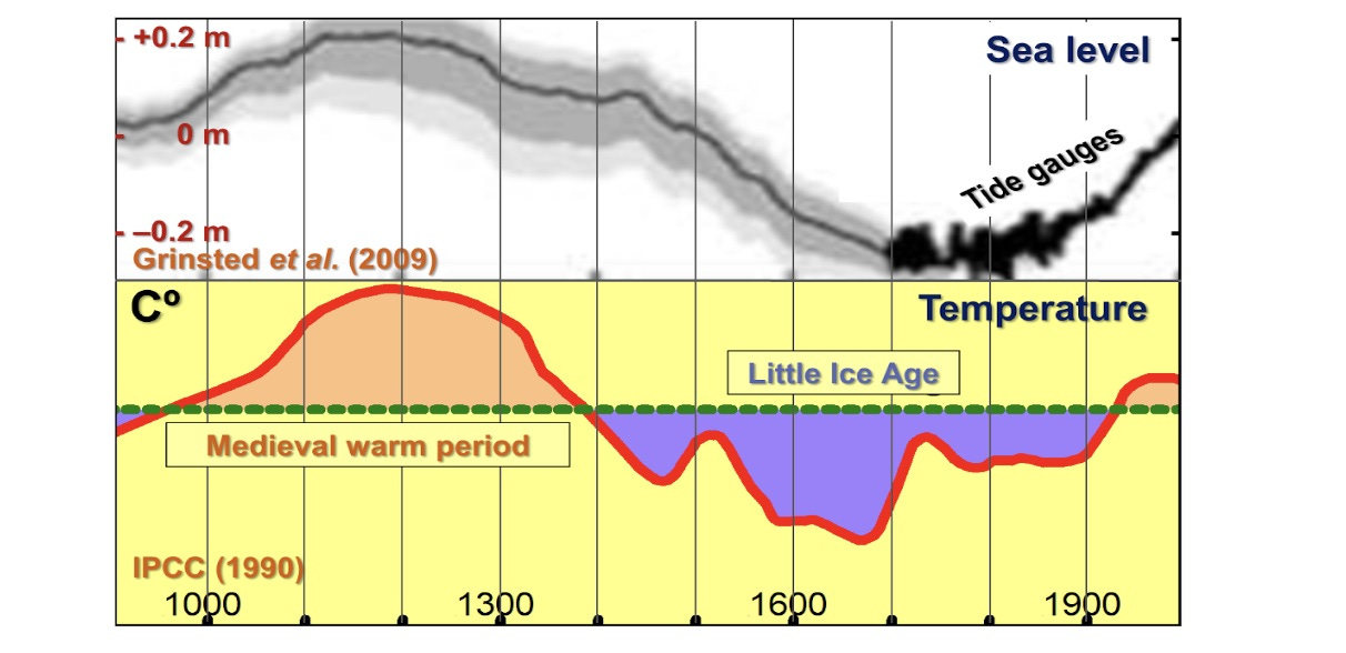
The Medieval Warm Period that [Michael Mann] the denizen of Penn State (or should those two words be transposed?) so ingeniously tried to abolish with his Hokey-Stick cartoon is revealingly present in both records. The Warm Period (I remember it well) was warmer than the year 2000. That was why we were able to build the great cathedrals of Britain and Europe.
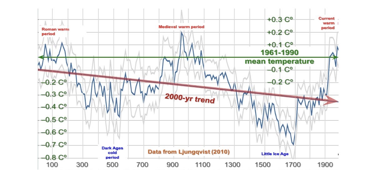
Here is another record of global temperature changes, this time stretching back to the year dot. It was as warm in 100 AD as in 2000.
Again, the peak temperature of the medieval warm period is shown as warmer than the year 2000. Yet the planet somehow survived.
As Lord Monckton observes elsewhere in his post, it is easy to make the (purported) recent rise in temperatures look alarming: Just change the aspect ratio by stretching the vertical axis (temperature) and shrinking the horizontal axis (time). How else is one supposed to alarm the gullible portion of the populace with a story about a (purported) temperature change that is dwarfed by the daily experience of almost everyone on Earth?
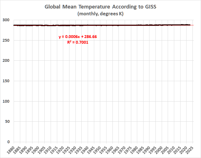
With that in mind, let’s look at the federal government’s official temperature records (here), which are produced by NASA’s Goddard Institute for Space Studies (GISS). The GISS database comprises surface thermometer records going back to January 1880. It takes a lot of massaging to construct a monthly time series of “global” temperatures that spans 142 years with spotty coverage of Earth’s surface (even now), and wide variability in site conditions. There’s the further issue of data manipulation, an egregious example of which was the erasure of the pause that had lasted for almost 19 years.
Taking the GISS numbers at face value, for the moment, what do they suggest about changes in Earth’s temperature (whatever that means)? Almost nothing, when viewed in proper perspective. When viewed, that is, in terms of absolute (Kelvin) temperature readings:
If the temperature record were correct — and it isn’t — the trend represented by the red line would suggest a rise of 0.72 degrees Celsius (1.296 degrees Fahrenheit) per century. Inasmuch as 1880 was smack in the middle of the Second Industrial Revolution, it is only reasonable to begin there, rather than in the late 1970s, where alarmists often prefer to begin (while ignoring long pauses in the rise of estimated temperatures since then). In any event, Dr. Ball and Lord Monckton (and many others) have put the recent rise in perspective, so I will say no more about that.
THE INADEQUACY OF THE DATA
The (purported) variation in Earth’s “average temperature” since 1880 been minute. The maximum of 288.52K is only 0.8 percent higher than the minimum of 286.34K. This minuscule difference must be swamped by measurement and estimation errors. It is credible that Earth’s average temperature — had it been somehow defined and then measured consistently over the past 142 years — would have changed less than the GISS record indicates. It is credible that the observed uptrend is an artifact of selective observation and interpretation. It became warmer where I used to live, for example, but the warming was explained entirely by the urban-heat-island effect.
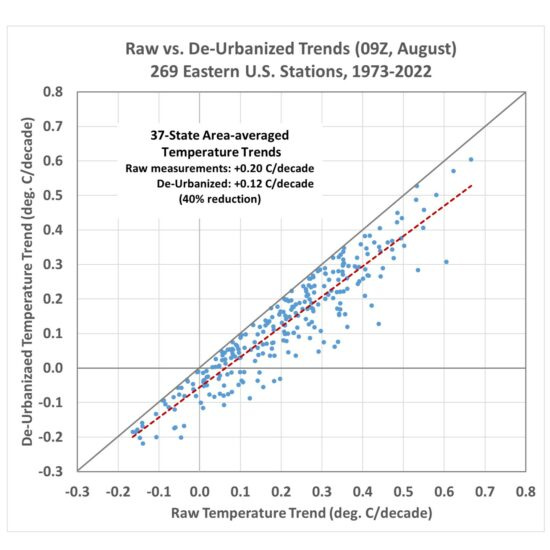
Which brings me to another aspect of “global warming” which hasn’t been properly accounted for. Dr. Roy Spencer addresses the urban-heat-island effect here:
[The following figure] shows the raw temperature trends versus the de-urbanized temperature trends. When stations in each of the 37 states [in the sample] are averaged together, and the state averages are area-weighted, there is a 40% reduction in the average temperature trend for those 37 states.
[T]his might well be an underestimate of the full urbanization effect on eastern U.S. temperature trends.
There is also evidence that warming is exacerbated by the reduction of cloud cover, which is poorly modeled. Charles Blaisdell summarizes:
The key to [Cloud Reduction Global Warming] is water evaporation, transpiration, or run off on land. When water (rain or snow) falls on the land it can soak into the ground or run off…. [W]hen ground water is not available the relative humidity drops… [A]ny man-made structure that covers … land prevents water from soaking in and increases [run off], When water is not available for evaporation or transpiration, … relative humidity drops.,,, Some man-made … sources of relative humidity reduction are:
· Cities
· Any man-made structure that covers the natural ground
· Forest to farm land or pasture land
· Pumping water from aquifers
· Forest fire land change.
· Flood water prevention like dams and levees.
“Global warming”, as shown above, is a minute phenomenon at best. If some fraction of “global warming” is caused by human activity, the use of fossil fuels can only account for a small fraction of the minute phenomenon.
CO2 FAIL
With respect to the role of CO2, I have observed that that there is no connection between CO2 emissions and the amount of CO2 in the atmosphere. This suggests that emissions have little or no effect on the concentration of CO2. A post at Watts Up With That? notes that emissions hit a record high in 2021. What the post doesn’t address is the relationship between emissions and the concentration of CO2 in the atmosphere.
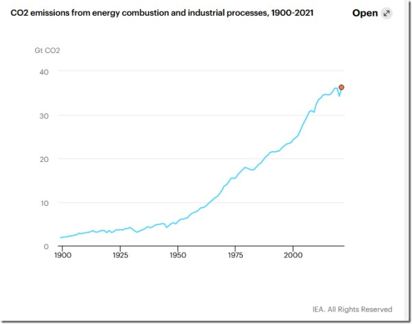
See for yourself. Here’s the WUWT graph of emissions from energy combustion and industrial processes:
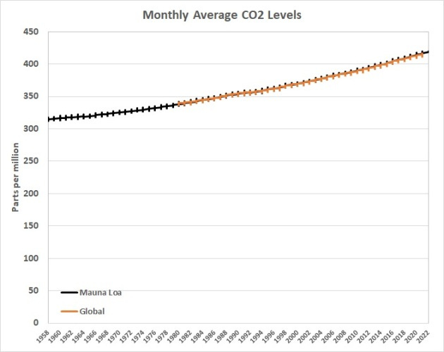
Here’s the record of atmospheric CO2:
It’s obvious that CO2 has been rising monotonically, with regular seasonal variations, while emissions have been rising irregularly — even declining and holding steady at times. This relationship (or lack thereof) supports the hypothesis that the rise in atmospheric CO2 is the result of warming, not its cause.
For example, Dr. Roy Spencer, in a post at his blog, writes:
[T]he greatest correlations are found with global (or tropical) surface temperature changes and estimated yearly anthropogenic emissions. Curiously, reversing the direction of causation between surface temperature and CO2 (yearly changes in SST [dSST/dt] being caused by increasing CO2) yields a very low correlation.
That is to say, temperature changes seem to drive CO2 levels, not the other way around (which is the conventional view).
MODELING ISN’T SCIENCE
There is a recent legal brief challenging EPA’s Endangerment Finding about greenhouse gases — and the resulting effort to eliminate the use of fossil fuels in the U.S. The brief offers ample evidence of the inadequacies and errors the reside in climate models. Here are some relevant excerpts of that brief:
EPA uses climate models to “attribute” warming to human greenhouse gas emissions, and to set regulatory policy. EPA uses models for attribution by claiming that observed warming cannot be reproduced by climate models without including the warming effects of human greenhouse gas emissions. EPA reasons that it does not know what else could be causing the warming, so it must be caused by human greenhouse gas emissions. This is not how real science, or even simple logic, actually works….
If a proposition is contradicted or unsupported by valid empirical data, no amount of appeal to authority and consensus and degrees and credentials can change that. That is the position EPA finds itself in with the Endangerment Finding. And it does not take a “scientist” to point out obvious flaws in logic and evidence. Anyone of normal intelligence can see that EPA is blowing smoke….
[O]fficial temperature records relied on by EPA to show warming temperatures in fact use fabricated average surface temperature data for vast regions of the earth’s surface for much of that record. This fact invalidates not only the surface temperature records line of evidence but also the physical understanding and models as well because to be valid themselves they both require valid temperature data.
Second, multiple separate and distinct econometric structural analyses of more than a dozen different credible temperature time series records show that after adjusting for natural factors, there has been no statistically significant trend in temperature in any of these time series.
Third, … the key assumption supporting the global warming claim and the theory in all models, the Hot Spot theory, is invalidated by the fact that there is, in fact, no trend in natural-factor-adjusted temperature data in the tropics.
I urge readers to open the brief and read the evidence regarding the first and second points. Here, I will focus on the third point:
A critical and necessary component of both the “physical understanding” of climate and climate modeling is the Hot Spot. The Hot Spot is explained in U.S. Climate Change Science Program Synthesis and Assessment Product 1.1, Temperature Trends in the Lower Atmosphere - Understanding and Reconciling Differences, Chapter 1, § 1.1, The Thermal Structure of the Atmosphere, p. 17- 19, explicitly relies upon the Hot Spot:
The presence of such greenhouse gases (e.g., carbon dioxide, methane, nitrous oxide, halocarbons) increases the radiative heating of the surface and troposphere. … In general, the lapse rate can be expected to decrease with warming such that temperature changes aloft exceed those at the surface….
In adopting the Endangerment Findings, EPA irrevocably placed primary reliance on the U.S. Synthesis and Assessment Product reports and the Fourth Assessment Report from the Intergovernmental Panel on Climate Change….
The U.S. Synthesis and Assessment Product cited above said that if the Hot Spot were missing, it would be a “potentially serious inconsistency.”… EPA also acknowledged in the Technical Support Document for the Endangerment Finding that if the Hot Spot were missing it would be “an important inconsistency.”
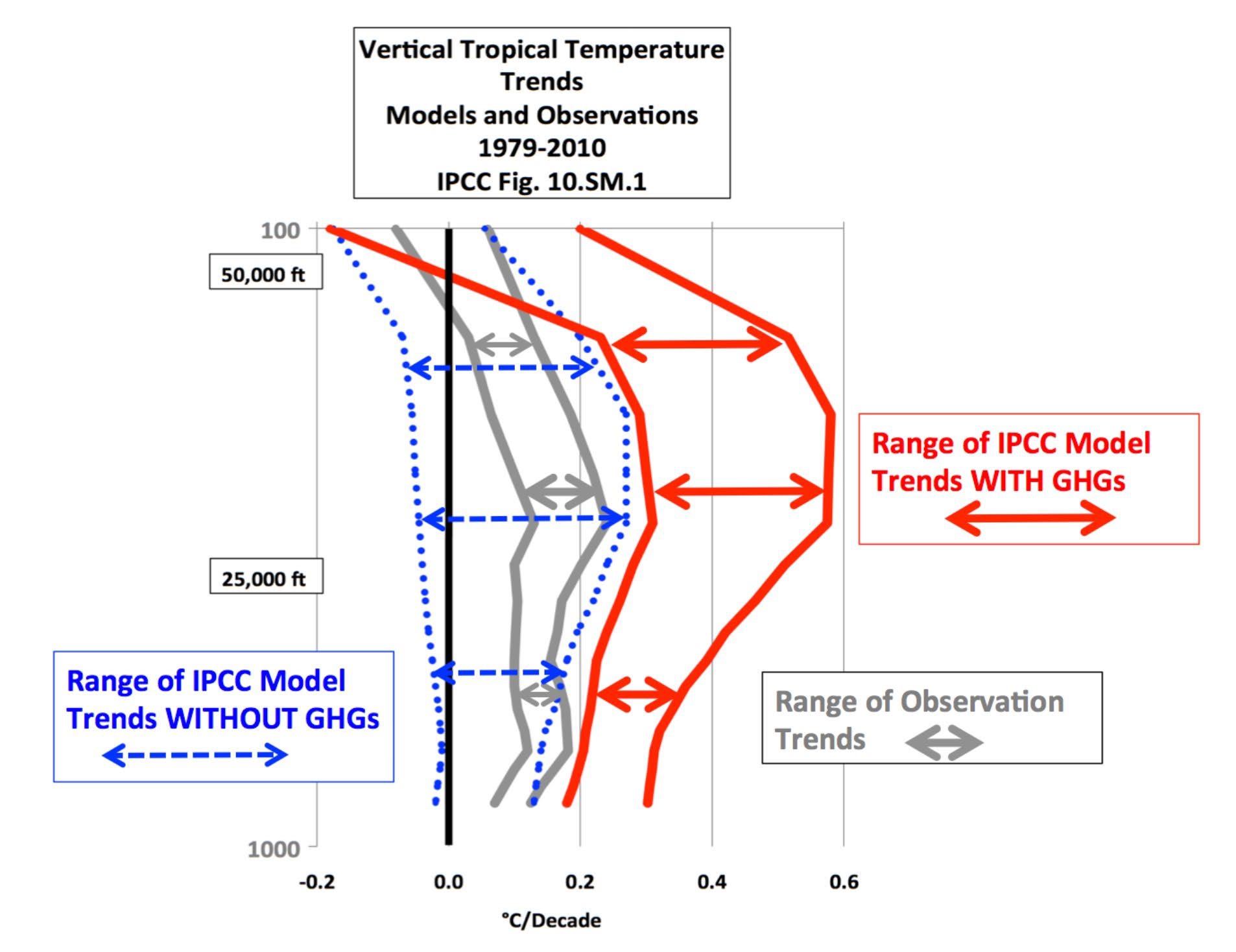
Dr. John Christy, in the previously cited Congressional testimony [link added], presented a comprehensible version of [the relevant figure] from the Fifth Assessment Report, in which the Hot Spot would be visible if it actually existed. Christy’s chart rewards a mere moment’s review, for it makes plain that observations invalidate the predictions of theory and climate modeling. His caption explains the chart:
Figure 5. Simplification of an IPCC20 AR521 Figure 4. The colored lines represent the range of results for the models and observations. The key point displayed is the lack of overlap between the GHG22 model results (red) and the observations (gray). The non-GHG model runs (blue) overlap the observations almost completely.
Dr. Christy explained the significance in his prepared testimony:
What is immediately evident [from Fig. 5] is that the model trends in which extra GHGs are included lie completely outside of the range of the observational trends, indicating again that the models, as hypotheses, failed a simple “scientific-method” test applied to this fundamental, climate-change variable. … Incredibly, what Fig. 5 shows is that the bulk tropical atmospheric temperature change is modeled best when no extra GHGs are included – a direct contradiction to the IPCC conclusion that observed changes could only be modeled if extra GHGs were included.
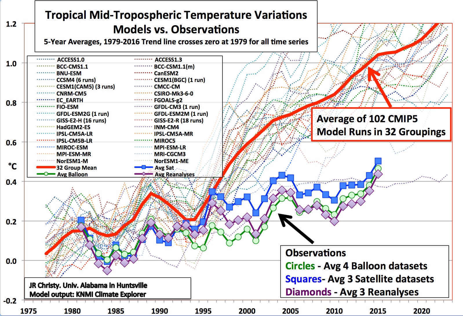
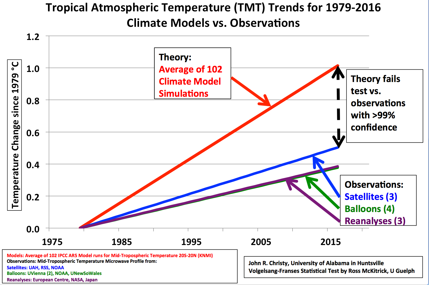
Which brings me to another scientific finding — also by Dr. Christy. In the same testimony he presented this graph and followed it with his observations:
Here we have climate model results (i.e. “claims” or “hypotheses”) to compare with observational datasets in a test to check whether the model average agrees with the observed data (i.e. the “claim” or “hypothesis”). We test the model average because it represents the consensus of the theoretical models and is used to develop policy which is embodied in policy-related products such as the Social Cost of Carbon, the National Climate Assessment and the EPA Endangerment Finding.
I provided the model and observational information as annual temperature anomalies (both tropical and global) to Dr. Ross McKitrick (University of Guelph) who has published extensively as an applied econometrician on the application of statistical techniques to the testing of climate hypotheses. He applied the Vogelsang-Franses F-Test method to these data as described in McKitrick, Ross R., S. McIntyre and C. Herman (2010) "Panel and Multivariate Methods for Tests of Trend Equivalence in Climate Data Sets”…. This method is particularly suitable for determining whether the trends of two time series are equivalent or significantly different….
What we are really testing here are the rates of warming depicted by the models and the observations for the period 1979-2016. I have simplified a depiction of the test in [the previous figure] so the rate of warming is directly viewed, showing what the test is measuring.
The basic test question is, “Is the red line significantly different from the others?” The results are shown in Table 1 [not reproduced here] recognizing that there is no equivalence between the model average trend and the observational datasets whenever the value of the test is [statistically significant] at the <1% level. As shown, all test values exceed [the requisite value], and thus the mean model trend is highly significantly different from the observations.
In other words, the models are worthless.
CONCLUSION
A proper explanation of the recent and minute variations in Earth’s temperature — if real — would incorporate all of the factors that influence Earth’s temperature, starting from Earth’s core and going out into the far reaches of the universe (e.g., to account for the influence of cosmic radiation). Among many things, a proper explanation would encompass the massive upwelling of CO2 from ocean currents, changes in Earth’s core, movements of tectonic plates (including related volcanic activity), effects of the expansion of the universe, the position and movement of the Milky Way, the position and movement of the Solar System, and the position and movement of Earth within the Solar System, and variations in Earth’s magnetic field.
But global climate models (or GCMs) are limited to superficial factors that are hypothesized to cause those changes — but only those factors that can be measured or estimated by complex and often-dubious methods (e.g., the effects of cloudcover). This is equivalent to searching for one’s car keys under a street lamp because that’s where the light is, even though the car keys were dropped 100 feet away.
The deeper and probably more relevant causes of Earth’s ambient temperature are to be found, I believe, in Earth’s core, magma, plate dynamics, ocean currents and composition, magnetic field, exposure to cosmic radiation, and dozens of other things that — to my knowledge — are ignored by GCMs. Moreover, the complexity of the interactions of such factors, and others that are usually included in GCMs, cannot possibly be modeled.
In sum:
Changes in Earth’s temperature are unknown with any degree of confidence.
At best, the changes are minute.
The causes of the changes are unknown.
It is impossible to model Earth’s temperature or changes in it.
It is therefore impossible to say whether and to what extent human activity causes Earth’s temperature to change.
It is further impossible for a group of scientists, legislators, or bloviators to say whether Earth’s warming — if indeed it is warming — is a bad thing. It is a good thing for agriculture — up to some point. It’s a good thing for human comfort (thus the flight of “snowbirds”) — up to some point. But for all the reasons given above (and more), it’s truly unknown whether those points will be reached. But even if they are, human beings will adapt — as they have in the past — unless their ability to adapt is preempted or hampered by the interventions of government that have (and will) wreak economic devastation and foreclose the conduct and implementation of real science.